Monday, June 8, 2009

Hotel Dare

An interactive art installation.

hotel dare brick

hotel dare room 103

hotel dare voyeur

hotel dare cottage


This installation at Poetik velvets. The Hotel periodically closes and changes in entirety.

Wednesday, January 7, 2009

Decripple your build tools

I recommend skimming through Tentacolor if you're a huge geek, there are some amazingly awesome things in there.

One of which is how to decripple your build tools.

Disclaimer: the TOS is sort of murky on the legality of this maybe? I don't think that's what they intended with that clause and it's more towards don't copybot shit, but yeah, I feel I need to give the disclaimer. But hey, it's all in xml files, so it's EASY to edit, if they didn't want us doing it, there are other ways they could have approached that instead. Basically, read Jacek's disclaimer, because I can't be arsed to write a decent one.

Go to skins\default\xui\en-us and open up floater_tools.xml with a regular vanilla text editor (unless you like Dazzle Jazz Hands, in which case you want skins\silver\xui\en-us. I avoid it like the plague, so if things are done differently, you'll have to figure that out yourself). Head down to Position (meters), and in the next 3 declarations of code, change decimal_digits="3" to decimal_digits="5" (in my testing, 5 is the max amount SL keeps track of, you just get wiggly numbers you can't do anything with if you go higher). label="X" is doing it for the x, "Y" for y, "Z" for z, of course. Things are in the same order as the actual Build menu in here.

Do the same for Size (meters)! You can up Rotation as well, but 5's probably excessive for use there. You can also play around with the decimals in the rest of the declarations, as sometimes you can get more out of it (sometimes you can't).

The other SUPER DUPER AWESOME thing to do is fix your texture tab (which is talked about in this entry, this is all Jacek's smarts here). Transparency is capped in the editor...because the Lindens think we're idiots? I don't know. There's no reason not to make that puppy 100, so you can do full transparency in one click WITHOUT resorting to another texture.

Go to Transparency %, and bump max_val="90" to max_val="100"

I also up both the Repeats Per Face, max_val="100" to more than 100 too, because it's useful for Planar mapping (normal people have no need of this, but I've passed 100 repeats more than once. I haven't had to bump past 500...yet).

Unfortunately EVERY SINGLE TIME you have to update a viewer you have to go through this process again, which generally leads to me swearing, making due for a brief period, and then telling people I'm logging off to make my tools not awful (because you get used to them being awesome, and going back....sucks).

Sunday, January 4, 2009

Adjustment Layers, yay! Also, a tad on Actions

Ever wanted to, say, change the Hue/Saturation on a bunch of layers without flattening? Or Levels? Or Curves? Or wanted to change any of those things but keep the original stuff uneditted in case you change your mind? Well then, my friend, Adjustment Layers are for you!

However, I'm a total tease, and FIRST I'm going to tell you about Actions. Actions are another way to apply the same adjustment to multiple layers. It doesn't stay edittable....but it can also do so much more!


Lights, Camera, Actions!

Actions are great when you have repetitive motions you need to go through. Say you need to go through a bunch of files, auto level them, hue/sat them to the exact same value, rotate them 90 degrees clockwise, and resize them to exactly the same size. Actions can try to save our poor carpal tunnely wrists by doing this in one bing bang boom click, once we've done the first one. Actions can record any repeated motion with exactly the same settings, and save that to be applied with one click, regardless of how many steps, at any time.

Firstly here, I'm going to assume throughout this (and, really, all my other) rambling, that your window setup is like mine. There's no real reason for this assumption, other than I think I pretty much keep the default, and you may have to.

You see on the probably right side of your screen (your right, not its right....ok, so I don't think I've mentioned this, but I have a really hard telling my left from my right. So if it's not there, look at the other right, ok?) there are these windows. One of them, possibly the bottom, is where you do your layering magic . But anyway, each of them have these tabs at the top with other options. Right now, I want you to find the one that says History. It should have another tab that says Actions.

If you can't find it, pull down the Windows menu, and choose Actions. If it has a checkmark next to it it's already center stage- if not and you click it, it becomes active, and pops out if you don't have it up already.

There are a couple of folders- Default Actions, possibly Textures. Make a new one, name it "Mine" or "Tralala I can't hear you" or what so ever you please. This is where you will keep your actions so you can find them.

Take your first file, or layer, that you will be applying all these same things to, and make it active. Create a new action in this folder with the same new icon you should be familiar with with Layers. Name it something you can remember, and hit "Record".

Now, do your stuff! Remember, Actions are reeeeeally dumb. They can do exactly the same thing, nothing else. However, they're also kind of smart, you can set your resizing to width by pixels, or percentage, or whatever, and it defines by what it sees set (so you can always scale by 50%, or always 512 wide, or set both height and width to pixels)- it also can apply identical filter settings, or adjustment settings, or pretty much anything really.

Once you're done, hit the stop button, that looks like an old timey cassette tape player stop button. (It's the box.) Now, go to whatever you want to do just like you did....and hit the play button (the filled in arrow), with that Action selected. Sit back and oooooh and aaaaaah over the magic!

You can see everything your action is doing by expanding the arrow next to it, it will show each step with a checkmark next to it. You can toggle steps on and off with these checkmarks, and some expand further to see their settings, what it will apply when the Action is played. Actions will play from the one selected down, if you select one in the middle, skipping the first steps.

Actions are useful in some cases, useless in others. They may or may not be something you want to use. But keep them in mind, for they can save you a lot of hastle, time, and typing, when you do have things you can automate.


But! To get back on the train of thought that got toooootally disrailed there, plowed through a pasture with some cute bunnies, hopped on other tracks and went around a few circles, and finally is reconnecting with what we came here for: Adjustment Layers!


How I Learned to Stop Worrying, and Love the Adjustment Layers

Sorry about that. I get distracted by shiny things, and oh! hey! that's kinda useful crap too! My brain, she is kind of a cluttered mess.

Adjustment Layers are pretty damn superduperawesomefunsauce. They've got a lot of great advantages:

1) They are non destructive. Your original layers are still intact and full of every last drop of juicy information they started with.

2) They are infinitely adjustable. You can go in and tweak that red value 2 degrees up more if you want, you can do a rough "oh, I'll shove everything in that general dirction" and go back and do settings for reals later.

3) They apply to EVERYTHING below them. All layers, without flattening or doing each by hand.

4) They can have masks. You should have learned in our last installment how damn jibbing awesome masks are. This will make you love masks more.

And probably many more, but, eh, that'll do for the sales pitch for now. Once you've used them, you too will squee with delight.

Now, to do: Look to your Layers palette. There are a bunch of wacky icons at the bottom. Mine are chain, squiggly f in a circle, box with a hole in it, circle that's half black/half white diagonally, folder, folded up page, trashcan. In real world terms that translates to:

Link (chain), which links layers so when you move one, you move all, and such things;

Layer Style (f in a circle), which lets you do fancy smacktacular things like drop shadows the easy way, none of this making a selection, filling it with black on a new layer underneath, and blurring it until it looks good like the old days;

Mask (box with a hole), which should you should somewhat understand from our previous installment;

Fill or Adjustment Layer (half black/half white circle, diagonally), which is what we want!;

and New Folder, for putting layers in folders; New Layer, which you should be well versed with; Trash, which you should also be well versed with.


Pull down your half black/half white circle. Pick the type of adjustment, like, say, Hue/Saturation. The normal Hue/Sat thing pops up, move your sliders. Every layer under what you've got selected, including what you've got selected, goes what you choose, like magic! You've got a layer now that's got a wacky sort of control panelly thing instead of a drawing box as its icon, with a drawing box full of white next to it.

If you want to hue shift everything there, we're done. If not though, we have options for applying this selectively. If you want to change your selection by masking, turn to Page 3. If you want to have your adjustment layer apply to cutouts and not a background, turn to Page 5.

Page 3 - Masking for Fun and Profit

You have chosen to play with masking! Masking is a highly rewarding way of dealing with your adjustment layer. You can do things like apply a black to white gradient on your mask to fade the change, or guassian blur selections, make selections off of other layers, or draw what you want directly on your layer. White will show the effect. Black will hide the effect. Draw right on your layer with black and white to change how the effect deals with the layers below it. You can, for instance, make an adjustment layer for shading on clothing, delete it all so it's black, and draw on it with white for the shadows, and this will apply your adjustments. You can easily shade patterns! You can change base layers instead of hue layers on top to change colours of things! And, best of all, you can go back and tweak your shading at any time without messing up your original image- those of you who dodge and burn shade may find that you can get the same effect with adjustment layers without having to start all over when the cat hops up and knocks your mouse arm!

In short: anything you can do to a regular layer, pretty much, can be done to an adjustment layer mask. It will be done entirely in greyscale, and the amount of white in the pixels will determine how much the adjustment shows. Adjustment Layer masks are exactly like layer masks, folder masks, and channels.

For the end blabbering that doesn't really make any difference, turn to Page 8.


Page 5 - You Mean You Kept the Easy Way for Last?

You have chosen the easy way, when you have cutouts! You're smarter than I am, you know, I ALWAYS forget this, and end up selecting and knocking out my selections in the mask the hard way instead.

Put all of the cutouts (basically, but this I mean "anything that isn't a full layer that covers the background and has an alpha") that you want your adjustment layer to apply to in a new folder. You get that with the Folder icon, as if you didn't know already. Now, place (or create) your adjustment layer on top of all of the layers. Still applying to the Background, and you don't want that. But, with one little tiny click...

And that tiny click is you at the top of our Layers palette, there's a dropdown that says "Pass Through". You probably already know about layer modes- if not, they're reeeeally fun. Overlay for highlight layers, for instance. Multiply when you want to make the darks pop. But I digress. Change that from "Pass Through" to "Normal", and now your adjustment layer only applies to things that are "solid"! Magically your background is now happy and free of your adjustment layer, since it isn't in the folder.

For the end blabbering that doesn't really make any difference, turn to Page 8.


Page 8 - The Mostly Unnecessary Conclusion, in which I Blabber Randomly

You're actually going to be happy I didn't illustrate this tutorial at this time. 1) It would have taken me way way longer to do, 2) I would have been illustrating everything with a really badly drawn cartoon of a mantis, and it would have been really bad as I am a totally incapable of using a tablet, as I thought through a lot of this last night as I was trying (and failing) to sleep, as my brain that makes sense decided to try to get a nap, and the other brain that suffers from really bad insomnia makes no sense, ever. Like, WHEEEEEEEEEEEEEEEEE! I'M NAKED! GIMME A CUPCAKE!, but worse. It sometimes involves imaginary critters and going over the same phrases of nonsense over and over like they are the most profound things in the whole wide world.

But anyway. That's adjustment layers! This has only passed on the very slightest and tiniest bit of how awesome they are. This should give you enough of an introduction to find out some of that on your own as you experiment and play with all the amazing things you can do, and enough choice words to drop in a google search for a real proper tutorial, which is how I learn 90% of the stuff I know how to do in Photoshop. Dear Google, I love you. Even when perfectly innocuous search terms drop me into yaoi websites. Or, wait, did I mean especially when?

Monday, December 8, 2008

A treatise on image formats

A few unrelated things lately have led to this. Now, a lot of you already know this, so please do skip over and ignore, but people from SL come from all sorts of backgrounds, so this is new (and rather important, if I do say so myself) information to some, as they aren't versed in such.

There are a large number of image formats available to us today. Some are more suited to certain applications than others. I come from a webnerd background, to a degree, so that's where some of my bent comes from, and I've been around long enough I've seen a few of these formats come to popularity. Now, you'll have to bear with me being opinionated and the memory of my failing brain, so some of the history here may not be entirely accurate. I'm old, dagnabbit.1 I'm also almost entirely self taught, so this is all stuff I randomly picked up here and there- and to add on, I'm going to gloss over some of the more accurate seriously technical bits and try to translate it into something that is, I hope, easier to understand, although possibly less technically accurate.

In brief: JPEG bad. BMP pointless and stupid. PNG awesome except for transparencies. Yay TGA!

I'm also going to do a bit of a runthrough of how _I_ do alphas with TGAs, at the bottom. This applies to Photoshop CS2, your mileage may vary when using any other version.


The JPEG and You

Ah, the ubiquitous JPEG. I've never really liked you, you know. Not even when you were the only viable game in town2 when it came to full colour- even though the poor little GIF was limited to 256, I always liked him better. (Note: I'm not going to cover the GIF. GIFs are lovely for small and portable oldskool pixel images with either/or transparency. They're pretty much useless when it comes to the sort of things you'll be doing in SL.)

You see, Mr. JPEG, you're a lossy format (lossy = oh, I can lose some of the information here and it won't really matter! No one will notice! Except when they will!). I really don't like it when someone decides that, oh, only parts of my image are important, let's just divide it into chunks, and make guesses about what the contents of the chunks are. I like all of my pixels equally, they are all my dearest darling wonderful children of light, and I am rather offended you think that it's "good enough" to just get kind of close.

In the land before the time of the PNG (oh, my favourite dearest for everything but SL, you magic format you), JPEG was really the option we had if we wanted to not have things be friggin' huge, and if we wanted to actually, you know, be able to load them. It's good for images with a lot of information in which not all of it is pixel specific- like photographs. Our eyes throw out a lot of that info anyway, since there's so much noise and variation. BUT, and here's the problem- JPEGs throw out MORE information. They use this funky algorythm that looks at chunks of pixels, and then instead of saving what each one is, it builds something that it is more efficient (at the time, as we're talking the deep dark ages here) than saving each pixel individually. But....if you ever save a JPEG a second time, it does that AGAIN, and it gets less acurate, each time. Plus, that slider of compression? Tells it the size chunks, the accuracy of guessing, and the more compression, the more assy your picture will be. This causes worse artifacting- you know when you look close and you can see those square muddy areas that aren't quite right?

Basically, AVOID AVOID AVOID. You do not EVER want to use JPEGs with SL. EVER. Trust me. There are better formats (and due to SL's recompression, the file size isn't even a deal). Also, in anything you do, NEVER use JPEGs for working copies. Save things you'll be working with again as any lossless format instead, because you lose information every time you save a JPEG, until you start seeing the mush, and that's crap.

If you're making sculpts, and you save your sculpt maps as a JPEG...You're fucked. 100% double fucked. Your sculpt map turns to jelly, because those actually need pixels to be WHAT THEY ARE, not just a half decent guess with a blindfold on. If you've got some severe lumpy mesh deformation going on, this could be your problem. Make sure no exporter or anything along the way uses JPEG.

Plus, SL uses JPEG itself. It recompresses everything you upload into JPEG2000 (which is a fancy smacktacular JPEG format that does more stuff, but is still a pissy little bastard and I hates him), so your artifacting gets worse due to the multiple save rule. Bright side? Your hugeass TGA file is a managable size and can actually be loaded by people's computers faster, and that's why they use it. Even though I'm still kind of against it. I told you I was opinionated!


The Mighty BMP, or Mommy, Why Is My File So Huge?

BMPs (Bitmaps, should you ever be at a dinner party and feel the need to show off that you are a GREAT HUGE NERD) are a really old skool format. They are lossless, so they fit my "use a lossless format" criteria. They're an old Windoze format that lets you save what you actually want (PICTs were the Mac equivalent, as they wanted to do something different, read: more efficient. Once upon a time it wasn't always easy to open PICTs on Windows, but I never had problems with BMPs on Macs. This is all ancient history, and feel free to completely ignore the old lady nattering on about her childhood and walking uphill to school, both ways, in the snow).

The downside though? Dear mother of god that's a big file. SL used to save your screenshots as BMPs, and you had no say in the matter. Which is why your harddrive filled up by leaps and bounds if you took snaps, because it's a horribly inefficient format, and we live in the modern age of miracles and flying cars, and have better options now. The newer SL viewers allow you to save your snapshots as PNGs. Do that, and be happy, as you don't take one snapshot and have your terabyte drive going "oh hai, I gots no more space."

Basically, we've another example of AVOID AVOID AVOID. Not because you're fucking yourself over with the actual image, but because there are better ways to do things now, and we don't need to bother with this jackassery anymore.


The PNG Comes to Save the Day. Sort of.

Once upon a time, there was this new up and coming format, the mysterious PNG. It was going to be magical and mystical, and let you put images in webpages that had more than 256 colours, but also were lossless and crisp and beautiful. What's more, this magical fairyland format was going to let you do transparency, which JPEG did not, and, oh!, you could also do gradual transparency so it wasn't just one colour set to clear, but you could have gradients and fades and it was all wonderful and beautiful and we lived hapily ever after.

And, of course, while this was a format targetted towards the web, Internet Explorer dragged its feet on implementing it properly, taking years and years to implement the transparency on the PC, while the Mac, and Netscape, had it wonderfully. Yes, I'm talking about Netscape, back when they actually updated it regularly, when it was the viewer of choice for most people. I told you, I'M OLD.

PNG is my format of choice when saving snapshots, it's lovely and portable, and it loves each and every pixel as all of its beautiful and perfect children, and wouldn't dream of forgetting one. I used to batch my screens as PNGs and trash the BMPs, to make space. It's as crisp as BMP, and your screen as you're seeing things, but it's smaller file size and takes a lot more to fill up your harddrive.

In short, it's perfect. All of the advantages, none of the disadvantages.

Oh, wait. That's not entirely true. There are disadvantages for content creators: the white halo of dOOOOOOOOOOm.

When it comes to making textures, PNGs are not quite as perfect as you would hope.

If you are making textures with no alpha, you're golden. Now, if you're making those textures in PS, you want to make sure they are REALLY without alpha, due to the dreaded alpha flicker- so make sure your PNG is totally and entirely flattened before saving, and says Background, not Layer 03, in the layers palette. Layer 0 gives you an alpha channel you aren't using- so it all looks nice and lovely, but you get it in SL and put a texture with alpha in front of it and cam around...and oh crap. Our z sorting issue is the price we pay for features like light, so we put up with it....for now. Even though it can bite my shiny metal ass.

The problem with PNGs, see, is that any pixel that's fully alpha, doesn't exist in colourspace. And because we read things at multiple resolutions with SL, and the way that it deals with the transparency (I'm going with "it's all JPEG2000's fault"4, although I sort of mostly ignored that format because it did a lot of floundering and dying in the areas in which I was interested....it was totally someone's pet nerd project, to use JPEG2000. One of the devs fell in love with the format and convinced everyone else he was right), the dead space gets SEEN. And dead space = white. So you get white edges, because SL divides the image up into "pretty colours" and "this is what we see" and loads them separately.

(Note: That Interlaced or none prompt? Is a loading order thing5. It means nothing to you, since SL makes them JPEG2000. I always leave it on none.)


Oh, Wait, You Mean You Want Me to Use a Real Game Format, Mr. TGA?

Our workaround here, is the TGA. Now, TGAs have disadvantages: namely, like BMPs, they are inefficient in their lossless compresion. TGAs are an actual proper format used in game design for real things, and it's got all sorts of extras that BMPs don't, and that's part of why it has the file bloat- even if you aren't using it, it sort of leaves the door open and decides that it needs to keep track of it all anyway.

I didn't say it was really the most brightest crayon in the box. Just that it was what worked the best!

I save ALL of my textures as TGAs, regardless of whether they have an alpha channel or not. It's easier for me than flipping back and forth to PNG, but that's a decision I leave up to you. Things with alpha channels should be TGAs though, period.

You see, TGAs save the dead space! They do alpha channels separately. This can make them more of a pain to work with, if you're used to the PNG way of just leaving areas you don't want seen with nothing on them. Because, see, with TGAs, your entire image is filled, and flat, and you don't see the transparency at all. And in the next section....we'll talk about the solution to adding your transparency. Look, really useful stuff finally!


Masks, Channels, Alphas, and How to Make It Not a Filled Up Square

TGAs are so useful because the alphas are separate from the image. You paint outside the lines on the image proper, but you make the lines somewhere else. If you're unfamilar with this way of working, it might be a bit of a challenge adjusting how you do things to make it work. I'm not going to tell you the way to do that, you're going to have to find out what works for you, as everyone finds a different way to do things. (After all, they're sort of endless!)

Now, technically, this applies to CS2. It MAY apply to other versions, however, I make no guarantees.

Do you know about Masks? Masks are lovely. If you have every used an adjustment layer, you see that black and white box, where the white areas get the adjustment layer applied, and the blacks don't? That's a Mask. Basically, a Mask is a separate alpha channel you can apply to any layer or folder, it's a little black and white box that pops up next to your layer (or folder), that lets you draw on it in greyscale. White = visible, black = invisible, and the greys in between are the gradient along the way to give you pretty edges and not make things pixelated. To add a mask to any layer, select that layer and hit the square with the circle in the middle in the bottom of the layers tab. When you have a mask and a layer, the one actively selected will have a dotted box around it in the layers tab, so you know which one you're drawing on.
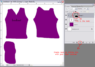

Yes, a drunken monkey drew this. Obviously, this is not what it should REALLY look like.

Now, to see your transparency in this brave new world of TGA, so things look like what's you're used to, make a folder, put evvvvvvverything in that folder, all your layers, and make new layers as you go in this folder, and make your mask on _that_ folder. Now, everything that gets seen, gets seen! And everything that doesn't, doesn't! It looks just like when you were doing PNGs! (Even if it means you have to _do_ it differently.)

When you turn that mask off, by holding Shift and clicking on it, you should see all the spaces outside the lines. Which should be very similar to the pixels next to them, that are seen. I leave it to you to decide how this is done. Fill a background layer behind it all with a colour that fits? Smudge an underlayer out? Draw all over the dead space in the first place and make things keep going? (This last one is my way, but I also come from a different graphic background....so I was doing it anyway.)

To make your mask, you have a few options. You can select a layer, or just make any selection, and either make your mask while that selection is active and it will apply it, or fill the mask with white (or black, if you want it invisible) in the selection (delete with your choice as the background colour, as a real fill may screw you over). You can also take your paintbrush and draw your mask right there as you go, using white to reveal areas, black to conceal. You can also use vector masks, which let you use Paths (PS's gimpy vector tools) to make hard edged selections that remain edittable. (Note: If you are interested in this, look up PS tutorials on Paths and Vector Masks for the techniques, I'm not going into it here. Its usefulness entirely depends on how you want to do things- it can be useful, or it can be extraneous and something you'll never want.)
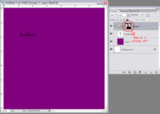


Now, once you're done, and you've got your image that spreds out beyond the invisible edges, and your lovely alpha mask....Turn that alpha mask off. Hold Shift, and click on it, and boom! your lovely selection goes away. Now, select your alpha mask (ctrl+click on mask), and go to the Channels tab. It should be in the window with Layers, it should say "Layers", "Channels", and "Paths" for the tabs at the top. Make a new channel, the same way you make a new layer, and fill that with white by deleting, or hitting invert, or whatnot.
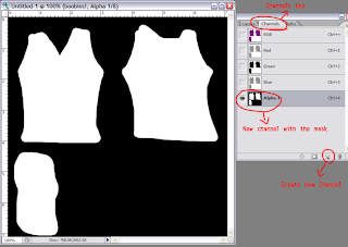


Now. DUPLICATE YOUR IMAGE. Trust me. You don't want to lose everything when you flatten it and accidentally save instead of save as. And you DO want to keep a layered backup, I'm sure you know by now!

Now, flatten your image. With the mask inactive, so it's all that messy outside the lines, and you have no lovely alpha....OR DO YOU? Because, see, you've got it in your channel!

Save your image as a tga. Make sure Alpha Channels is ticked on (and As a Copy isn't), then, it will prompt you:

16 bits/pixel
24 bits/pixel
32 bits/pixel

Ignore 16, forever and always, it means nothing to you. CHOOSE 32. If you have an alpha channel, you NEED 32. On the other hand....if you don't have an alpha channel, to get away from the dreaded flicker, you NEED 246. That says "oh hey, no alphas for us, nevermind!" instead of "I have an alpha channel even though it doesn't look like it, I just choose to make everything visible, so I can fuck with everything with transparency around me." Those extra 8 bits ARE the alpha, if it has that many, it has an alpha, period (and, as an added oh hey PS hates us bonus, if you don't have Alpha Channels ticked on in the save as dialog...it trashes your alpha channel and puts in a pure white one if you save as 32). If it doesn't have them, no alpha, regardless of your masking. You can open that file up again to look at it, and see if there is an extra channel there. (Remember, there will ALWAYS be 4 layers in there, for full view, red, green, and blue. The colour separations are awesome if you get into some wacky sculpting stuff- but generally not so useful with regular textures.)

Other uses for channels: you can cntl+click a channel and it will load that selection. If you have a selection you want to keep? Hey there sailor! There are also certain filters that can be used in conjunction with channels for whizbang effects. Now, you MUST make sure to delete all extraneous channels before you do your saving, since you don't want it to get confused!

For a last somewhat helpful note: if you're making clothing, save your image as 512x512, always. I make them double size, but my last step is scaling down. Why? Because SL will scale to 512x512 for you, regardless of what you want. That IS the resolution the avatar textures will be, period (and you gain nothing but crappy jagged edges if you go smaller). There is no way to squeeze more out, and this way you aren't making SL do another step of work, so things load better, faster, stronger. I work larger because I can play around with more detail and have more fine control.


1Ok, I'm not really THAT old. But I might be older than you. I remember the day before you young whippersnappers and your css, when we had to do all our formatting in HTML and tables, and we liked it.

2There was the BMP and PICT, of course, but I'm coming from a webnerd background here, and those were not viable options. Plus, I'll be getting to the BMP later.

3The thing you have to understand about computers, is that they're sort of dumb. They can't figure out there's no alpha unless you tell it repeatedly7. Flattening to Background is how you tell a PNG that no, really, FOR SURE, you didn't mean to have an alpha channel. Honestly. For reals. Trust me. No, really, PNG, I'm serious.

4In reality it's probably Photoshop's fault, with the way it does PNG alphas- since there AREN'T any pixels there in the first place, so it has to make shit up, and white is the colour of imaginary angel pixels, or something. However, I would really rather blame it on JPEG2000, because I keep grudges. Also, because of the way SL works, you get to see those imaginary pixels, so THERE, that IS JPEG2000's fault. Neener.

5Interlaced is kind of nifty for the web, back in the day when we were all on dialup and things went slooooooow. It would load the image in "stripes" kind of, instead of top down, so you would sort of see the image, and it would get clearer as it loaded. Kind of. Again, ignore.

6Again, see "computers are dumb". Because really, TGA, even though I told you once before already, I REALLY TRULY want an alpha channel if it's 32 bit7. And I REALLY DON'T if it's 24 bit. Also, if you save a TGA with a channel at 24 bit? Your channel GOES POOF. So make sure you save as the right bits! Also, this is another reason we make a duplicate of the image!

7There are, of course, limited cases in which you WANT an apparently solid image to actually have a transparency channel- if you're doing something fancy with invisiprims (like the flea with the magnifying glass), things that "look" solid will become invisible, and in limited cases, it's quite a clever effect. Just...not so awesome, unintentionally.

Thursday, November 20, 2008

I dream of wide open spaces

The Open Space announcement from LL was...disappointing. It's the right decision done in totally the wrong way, basically. Yes, limitations needed to be added to the existing, and obviously there needed to be another tier, in between the two.

But this....is verging on ridiculous. To go from 3750 to 750, for the same price, is just... Really, did they think this was going to make anyone happy? And then, the new Homesteads, still to be stacked in 4 (oh, _maybe_ we'll consider 3), since the stacks of the Open Spaces were what they were stating as the problem?

Really now. This is just another way to get people to leave. God knows, I'm considering it (I won't, of course. At least, not until my friends do. But I have signed up for another grid in the meantime, but they're a ways away from being a real threat....but eventually, they will be).

Instead, what I think they SHOULD have done, is make Open Spaces what they were meant to be, what they were SOLD as: 3750 prims. However, add in the hard limits to avatars and scripts to ensure they aren't "abused". Then a midway sim that's stacked in 2, rather than 4, that's more of a half sim, again with limits that are somewhat less restrictive than Open Space. I fear this is a case where they saw all the money they "could" have been making by charging more for the minisims, and got too greedy. There were problems that they should have seen coming (seriously. I saw them coming and I'm not on the damn technical staff and don't know much about their load capacity), and could easily deal with, since they run the whole system.

There's a huge amount of art and beauty that will soon be dead because of the change: places that could have been worked as legit Open Space sims with the limits placed upon them, but which need the higher prim limits (750? That won't go anywhere). A lot of people were able to justify the price tag for sims that served little purpose other than to be a playground of beauty, and SL NEEDS more of that.

I'm sad I won't see them all before they go- I will only see a small fraction of them.

Wednesday, April 16, 2008

Mapping problem, cont.

(These are mostly personal musings on problem- I'm not explaining it explicitly enough to describe it for others currently [primarily because I think to really explain, I'd have to draw diagrams, and I'm still not sure how well I could translate 3D deformed space to 2D flat and still retain any sort of clarity]. I'm still looking around for potential solutions, but am just coming up with more problems instead.)

Upon further research, the wall gets taller. Apparently there are a number of imperfect tools out there to try to get around the problem (including one that takes an obj and imports it as a sculpt through the SL menu...which, aside from the fact it's extremely touchy on what you can ever try, I generally don't trust at _all_), and it sounds like they all do it badly. There's a big discussion on the forums about trying to do it and how tos in ways that...I just don't understand why they're trying to do it _that_ way, as it seems like the hard way to me. Looks like Blender is not the only program to not map proper though (no programs were raised as "well, you know x does it right, even if it is expensive" which isn't really heartening. If Maya actually got around it without all the hoops and etc....)

Tacked on, I'm not 100% sure I'm on the right page with the way SL does it. Mostly I'm a little perplexed as to texture mapping regarding, as they seem to be at odds to me (which is another dimension of The Problem with inaccuracy). At least in certain ways- it mostly comes down to "well, you stitch it this way and I get it. But you stitch it that way and I'm starting to get a little confused." There's also one more somewhat esoteric and bizarre stitching method I'd love to have, just generally (a modified sphere stitching, basically. It's odd and strange enough although it makes sense while modeling that I can't see it even being something they would consider adding, as much as it would be useful).

Worse, in regards to my immediate problem...I'm not sure where I stand on that at all. This is not 100% due to the inaccuracy problem (now, raise the prim limits to 20x20x20, and I wouldn't have any of that dimension at all, because I wouldn't have to worry about splicing bits and could skip my problematic steps. *sigh* I wih megaprims came in more useful sizes, and the massive chunk of them weren't just hacked to make it work in one particular manner this way, which means it won't with anything else), but also due to a bit of uncertainty how to actually approach certain features of the object itself. This is a point at which existing architectural reference would come in handy, as I'm not sure how x and y would translate properly, nor how much they would be desired. So yeah...spinning my wheels entirely until I can get a concrete vision on what I'm doing.

Tacked on, the thing for me...I'm still very heavily in the "that would be a nice thing to have" mode, not really the "ok, let's do this!" It's another thing that I need to wrap my head around the scale of before I can get much done, and I'm just...not sure at all. At least a) it's something that there is architectural reference of, even if I am not going those ways a lot, and b) I've already figured out how a fair bit of that will function regardless, prims willing.

Tuesday, April 15, 2008

Improper Mapping in Blender: a problem

I'm trying to be a little more zen about certain things annoying me (times when people refuse to stop jumping up and saying LOOK AT ME I'M RIGHT LOOK AT ME DO WHAT I WANT!...take a step back, a deep breath, and just stop feeding into it and walk away. They are free to think they won, in reality they aren't worth my time. There's a reason I'm a misanthrope). I know I'm also a bit less able to deal because I've effectively had a bad cold for a year and a half now. *sigh* I want to go home.

My new new irksome though is not related to people. I've finally run into the wall that I've known was there for a while about Blender's imprecision on mapping the sculpt texture. Instead of mapping the points where SL maps them, it has a tendency to basically map in between (this is most disasterous on the edges, as that's where the problem begins, and has the greatest deformation). This is not such a huge deal for a lot of sculpts: SL does a bit of deforming your mesh here and there anyway, although your seams may still be somewhat messy, which is not cool. This becomes a greater deal with sharp edges (which have needed a fair bit of PS post anyway, in my experience- even when they shouldn't), as, even when you redo the edges you've still got a pixel of messy lead in (which can be eliminated by making it the edge as well, so long as you can sacrifice it- but it still means the sculpt and texture are pulling off. One top of this, the corner corner top/bottom edges...are just a total wreck, because it doesn't pull them where it ought to.

In this case, I can probably reason through the math and do it all in PS from a Rokuro (not that I actually want to do that, but this problem right now is entirely fueled by the 10x10x10 prim size limit, it's not a hard shape in of itself), but that simply won't work in some cases, nor does it change the fact it's always stretching things improperly. I'm not comfortable with many of the tools in sculptypaint yet, and I don't think it has the robust _sculpting_ tools that I need, but it does map properly (too bad it doesn't import .objs itself for mapping), and, damn. Stairs. Truly, totally, awesome. Too bad I don't see a way to work another staircase I'd like to with it, that's going to be "a challenge" and require a lot of fixing it up in PS, I'm sure- although I think perhaps the map here has given me a good concrete view of how to (until I try it and find the niggling things I haven't thought of, of course). Aside from everything else, it's pretty brilliant for importing your sculpt map and finding out what havok Blender has dealt with the way it goes about it- whether it's even worth trying to pull into SL.

I've got an idea to try that will, I'm reasonably certain, require a bit of post to get functional (if it's even possible, which I'm not sold on- it's a kinda sorta maybe, not a perfect answer), to get around the problem. This model has enough other troubles inherent in the way Blender deals with it I'm not sure it's a model case to try though. (I think it would actually be pretty straightforward to write a program that would take the one data and convert it to the other correctly, that's just not something I'm up to. I do not write programs, and haven't any desire to learn that, a little light coding and scripting is more than enough, thanks.)